Adding Contrast to Your Drawing View
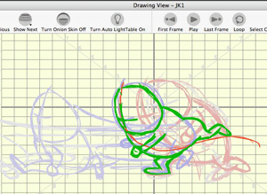
This is a simple tip that can improve your use of the Onion Skinning feature in drawing view. You probably already are familiar with Onion Skinning but if not, be sure to read one of my previous tutorial articles A Good Place to Start Part 1. One of the nice features of Onion Skinning in Toon Boom Studio is that you can customize the color for displaying the “previous” drawings as well as the “next” drawings. For example you could set “previous” to a color like red and “next” to a color like blue. (The color choice is a personal preference with the desired result being a strong contrast.) To customize your Onion Skinning you need to go to Preferences and select the Light Table tab. Additionally you can use View>Onion Skin>Show Outline on Onion Skin as a contrast aid if your drawing objects are already paint filled. But sometimes even with all of those aids you still might like some additional visual contrast to help you see multiple levels in your drawing stack more clearly. Believe it or not you don’t have to draw on a pure white digital paper. You can customize the drawing view background to make it easier on your eyes and to add contrast to Onion Skinning too. To do this you want go to Preferences and select the Interface tab. There you will find a custom color choice for the drawing view panel. Pick what ever color helps you work more productively. I often use a pale cream color because it produces less of a glare and improves visual contract in Onion Skinning.
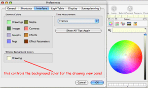
This tab also provides you a way to customize your element tracks to make them easier to identify in your Timeline panel.
Take Advantage of Colors as a Rough Drawing Aid
This is one of those tricks in animating that is so often not used, perhaps because it has to do with roughing out your animations and not finished work. I showed some basics of using forms in the construction of a character in a previous article Jumping into Animation Part 1. Much like the use of color for contrast can make it easier to work with Onion Skinning; contrasting colors are a great aid to roughing in a character. Not only does it help to use multiple scratch pad elements, but it is also useful to use different colors for each layer of your rough construction. Think about it like using several contrasting colored pencils for your rough sketching. I have a special color pallet that I created just for doing rough sketching which I import into every project. A great way to use Toon Boom Studio's color management system, which links color pallet swatches to their lines and fills, is to adjust the alpha or opacity setting of a color swatch used on a lower drawing layer when you want that color to be less visible. I crank my sketch pallet colors' opacity levels up and down often during rough construction. So I not only have the advantage of different colors for contrast, I also can adjust the visual brightness of a color too. It is like having a dimmer feature for the Auto Light table.
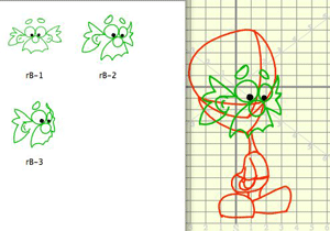
Here is an example of using colors and forms to construct a head turn.
Labels: Drawing View, Onion Skinning, Tips


2 Comments:
That's a lot of posting for one day... someone's been busy in Tuberville. The visual compliments to your old posts are a great addition. I never even played with the color settings for onion skinning, let alone the drawing view background. It just never crossed my mind, but when I read this I was laughing at myself, because I hate even writing on white paper, I always buy yellow legal pads, so I'm going to give that a shot with the drawing view & see how it goes. I actually read somewhere that black on yellow is the most gentle on the eyes, don't know for sure but it works for me. Thanks for the tip!
Hello... As I mentioned earlier, your website is an amazing asset. It's like having a textbook... Well done.
I have a question. I'm trying to create "twinkling" stars.. Only way I've found to do it is by making a bazillion tiny elements and adding a color effect... Same problem happens when I make an ocean scene and I want to accent it with white caps... Another BAZILLION elements.
With Flash MX, I just made one movie clip and poured it all over the screen...
These little accents really bring a BG to life...
Any suggestions?
Post a Comment
<< Home